10.15 Saturday Night -BRK-


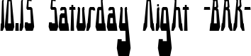
10.15 Saturday Night -BRK-, designed by Brian Kent, is a bold display typeface that channels late-night neon and retro club signage. The letterforms lean geometric in their backbone, yet each glyph wears intentional interruptions in its strokes—a signature broken detail that gives motion and personality to the page. Uppercase shapes dominate the rhythm, with compact silhouettes and crisp, squared terminals that read clearly from a distance. Numerals carry the same playful architectural feel, maintaining consistent stroke weight and a cohesive family look that works well in bold headlines.
This is a display face, intended for headlines, posters, logos, and social graphics rather than body text. The weight reads heavy on screen and print, delivering high impact with clean, crisp edges and minimal serif-like cues, which makes it versatile for modern palettes. Pair it with a simple sans or a contrasting script to emphasize the edgier vibe. The overall personality evokes a nightlife mood—bold, energetic, a little rebellious—without sacrificing legibility.
Designed as a distinctive identity tool, 10.15 Saturday Night -BRK- shines in branding, event graphics, music releases, and editorial headers. Use generous tracking to honor the intentional gaps in the strokes and preserve the font’s rhythmic cadence across headlines or logotypes. Pair with clean, neutral type for body copy, letting the display characters take center stage. The result is a memorable, contemporary mood that blends retro flavor with a confident, modern edge.
More faces...
This download contains 2 font faces
![10.15 Saturday Night [R] -BRK-](https://static.dailyfont.com/media/7978/1015-saturday-night-r-brk-64.png)