Seperated
Sliced, angular sci-fi caps with a retro LCD-readout feel

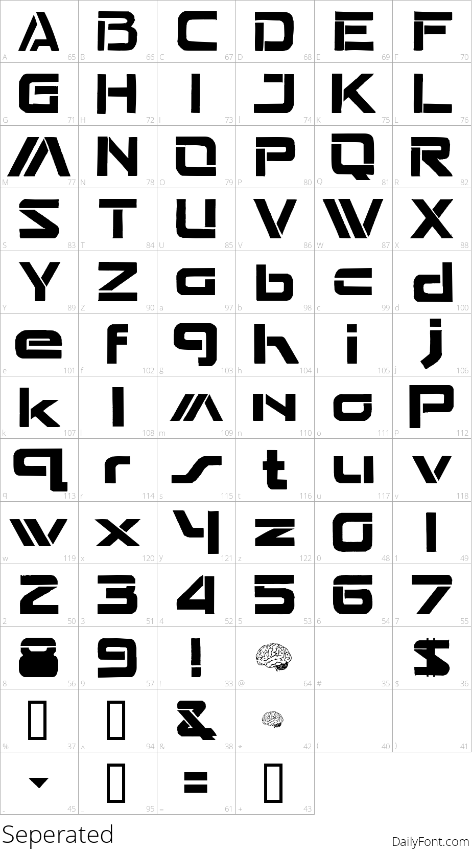
Seperated builds its sci-fi look out of sharp diagonal slices - nearly every letter has a corner cut away or a stroke broken mid-line, giving the alphabet a retro LCD-readout, almost circuit-board feel. It even hides a couple of tiny brain icon glyphs on less-common keys, a fun detail for anyone digging through the full character set.
The style fits retro-futuristic game logos, sci-fi movie posters, tech startup branding, or any HUD-style interface mockup that wants an 80s-computer edge rather than a sleek modern one. A few of the symbol slots are unfilled, so stick to letters and numbers for the cleanest results.
Download Seperated free for your next retro sci-fi project.