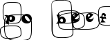
Edmunds Distressed
Worn, inked stamp-style caps with a vintage western look


The ink in Edmunds Distressed looks like it's running low - every letter is heavy and slightly broken up at the edges, the way a well-used rubber stamp presses unevenly onto paper. It's an easy match for vintage packaging, crate-stencil branding, and any label design chasing an aged, industrial authenticity rather than a clean printed look.