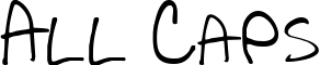
DearTeacher-Normal
Wobbly, uneven scrawl that looks like real kid's handwriting

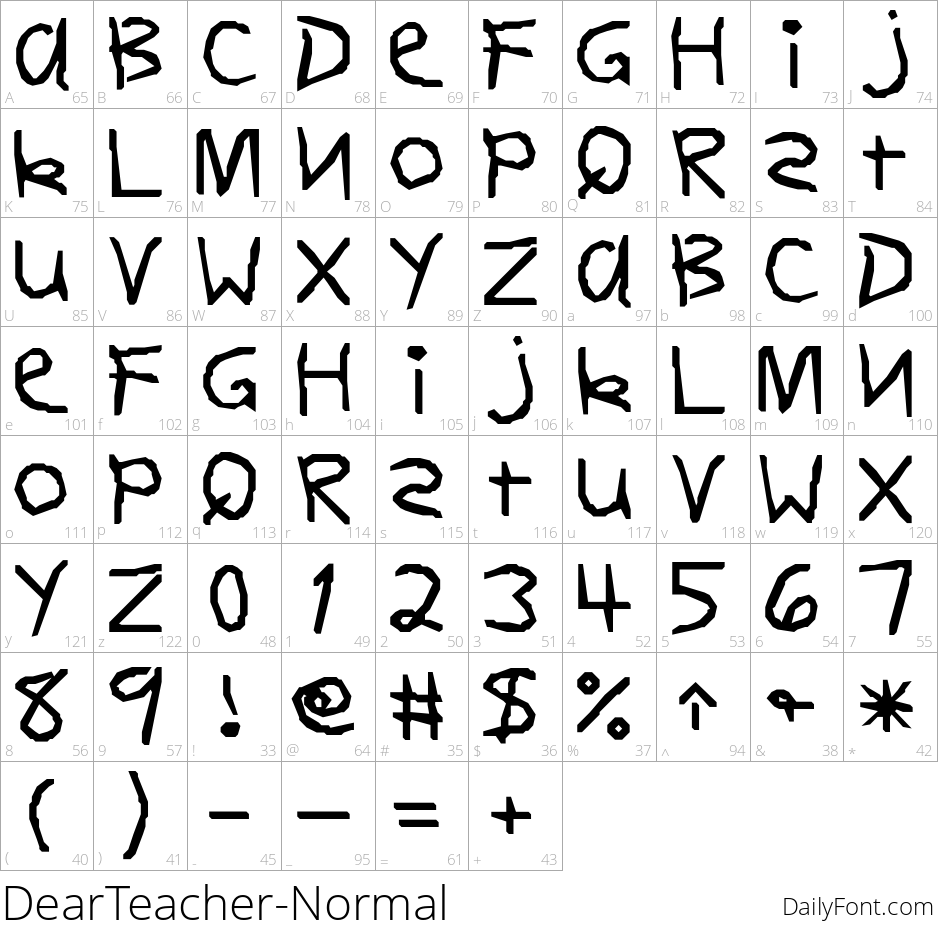
DearTeacher is a casual handwriting font built to look like a child wrote it by hand - uneven baselines, wobbly strokes, and letterforms that never quite match themselves twice. Numerals and basic punctuation are included alongside the full alphabet.
That homemade, unpolished charm makes it a natural fit for:
- Teacher appreciation cards and back-to-school flyers
- Classroom worksheets, bulletin boards, and school newsletters
- Kid-themed party invitations or scrapbook pages
Because the wobble is part of the design, it reads best at larger display sizes rather than dense body text. Pair it with a clean, simple sans for any smaller supporting text.