Designer Focus: Hoftype
Had to come back for another round with Hoftype fonts
This post may contain affiliate links. What this means is that if you follow the link and make a purchase we may get a percentage of the sale to help keep DailyFont running. It does not cost you anything extra, but it is something that we must disclose.
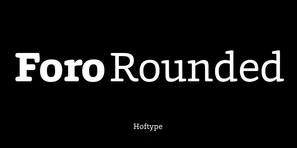
Foro Rounded
Foro Rounded is a charming font that offers a softer, more approachable alternative to the original Foro family. Its unique design exudes a pleasant haptic quality, making it perfect for use in a wide range of applications where a friendly, objective tone is desired. With 16 styles available, this OpenType font boasts an impressive set of features, including standard ligatures, proportional lining figures, and matching currency symbols, as well as support for Western European, Central, and Eastern European languages. Whether you're looking to add a touch of warmth or sophistication to your design, Foro Rounded is sure to impress.
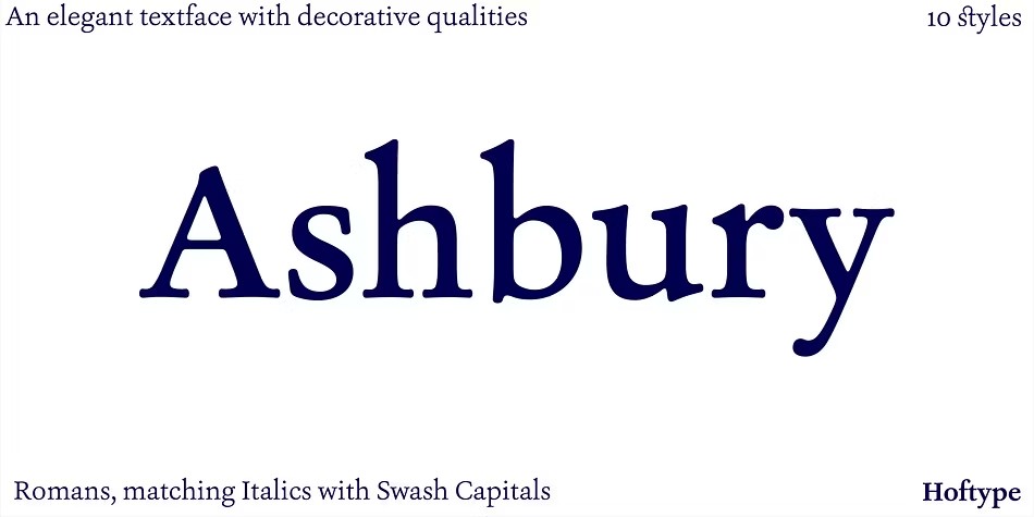
Ashbury
Ashbury font is inspired by the elegant transitional types of the 18th century, such as Caslon and Baskerville. While it draws from these classic designs, Ashbury doesn't simply revive them - instead, it reinterprets their formal aspects in a unique and refreshing way. With its flowing outline, Ashbury remains warm and inviting, yet assertive due to its solid stroke weights. This versatile font is well-suited for a wide range of ambitious applications, offering ten styles in OpenType format with extended language support for over 40 languages. Each weight features an impressive array of typographic details, including small caps, swash capitals, standard and discretionary ligatures, proportional lining figures, and more.
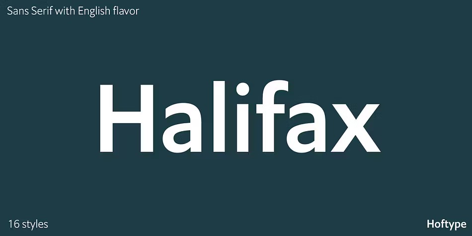
Halifax
Halifax is a refreshing take on classic English Sans serif fonts, drawing inspiration from iconic styles like Gill and Johnston. This approach emphasizes an open appearance and balanced proportions, resulting in a smooth line flow that's both readable and visually appealing. While Halifax incorporates some of the rationality found in central-European sans serif traditions, it still retains a distinctly English flavor. With 16 styles to choose from, available in OpenType format with extended language support, Halifax is perfect for creating ambitious typography projects. Its thoughtful design includes features like semi-ligatures, proportional lining figures, and more, making it an excellent choice for a wide range of applications.
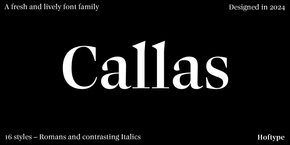
Callas
Callas is a font that exudes high contrast and a crisp, clean look, feeling fresh and lively from the start. With its unique blend of functionality and elegance, it's like marrying the classic sophistication of Antiqua with the refined flair of didonesque types. The result is a typeface that appears distinguished yet still manages to add a touch of extravagance, making it perfect for projects where you want to make a statement without going overboard. Whether you're looking for a font that's both stylish and professional or just something to add some excitement to your design, Callas is sure to deliver.
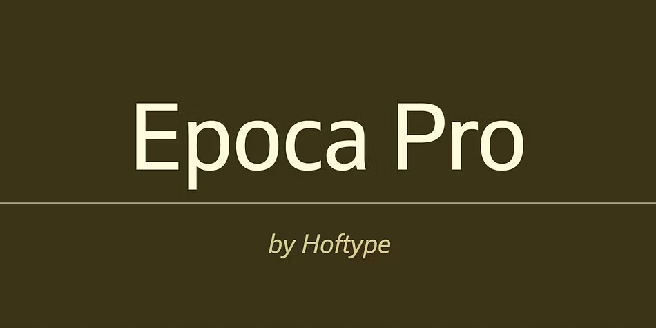
Epoca Pro
Epoca is a timeless classic, designed in 2010 to excel at both text and display settings. With its economical proportions, this sans-serif font exudes a neutral elegance that's perfect for a wide range of applications. Despite being sturdy and robust, Epoca remains a reliable workhorse, boasting a subtle angularity that creates a smooth, fatigue-proof reading experience even with large blocks of text. Available in eight weights and OpenType format, each weight features small caps, standard ligatures, and a suite of numerals, including lining figures, old style figures, currency symbols, fractions, and scientific notation – making it an incredibly versatile font for any project.
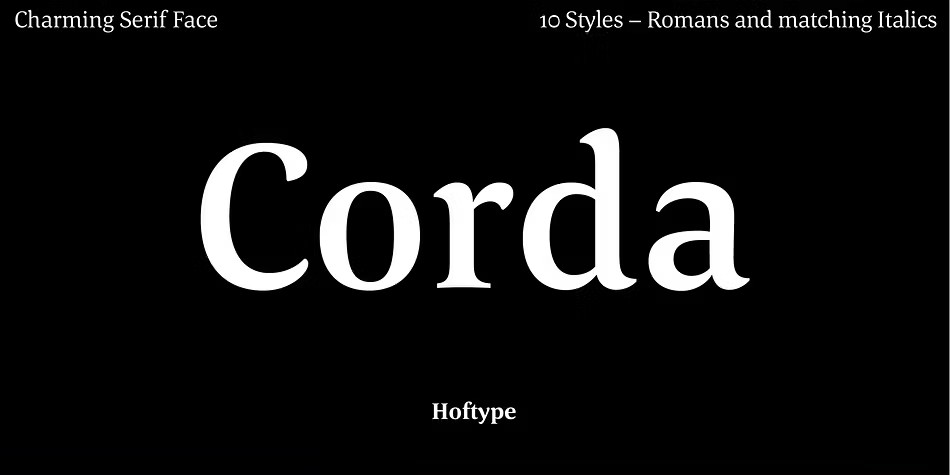
Corda
Corda is an elegant serif font family that exudes a sense of effortless sophistication with its smooth, flowing lines. Its semi-contrasted design gives it a light and airy feel, even in the heavier weights, making it a pleasure to read and display. With ten styles available, Corda is perfect for a wide range of applications, from body text to headlines. Its OpenType format and extended language support for over 40 languages make it an excellent choice for global projects. Additionally, all weights feature standard and discretionary ligatures, along with a range of numerals and currency symbols that are proportional and well-matched.
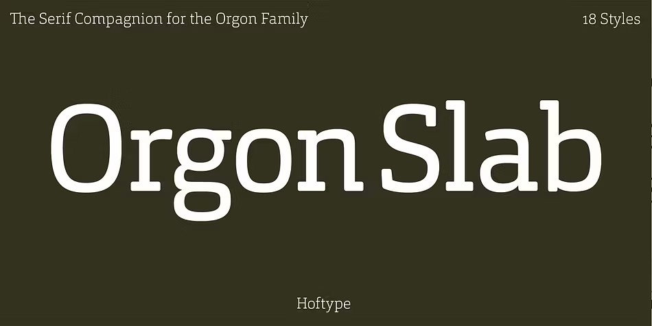
Orgon Slab
Orgon Slab is a perfect complement to its sibling fonts in the Orgon family, boasting a clean and unassuming appearance that prioritizes readability for both desktop and web applications. This slab serif font boasts an impressive 16 styles, making it ideal for ambitious typography projects. As part of the OpenType format, Orgon Slab offers extended language support, ensuring its versatility is matched only by its precision. Each weight features a range of advanced typographic elements, including ligatures, small caps, superior characters, and more, all designed to elevate your design work with ease.
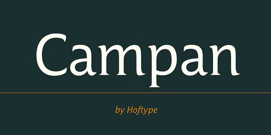
Campan
Campan is a unique semi-linear font that seamlessly blends the crispness of mono-line typography with the elegance of classic fonts. It excels in headlines, boasting a tall x-height that makes it a comfortable read in text applications. The Campan family consists of 12 styles, making it an ambitious typographer's dream come true. This OpenType font features extended language support and boasts an impressive array of glyphs, including ligatures, small caps, proportional lining figures, tabular lining figures, and more - all carefully crafted to create a harmonious reading experience.
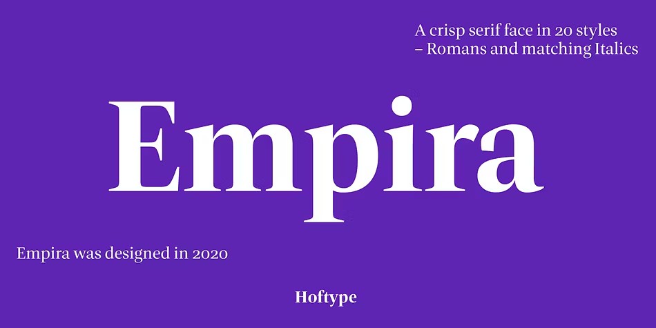
Empira
Empira is a modern font that stands out with its high contrast and distinctive graphical elements. While drawing inspiration from transitional faces, Empira's sharp and elegant shape is unmistakably contemporary. This crisp font appears fancy and sophisticated, making it perfect for various typographic applications. With OpenType format support, Empira can handle up to 80 languages. Its extensive range of styles includes small caps, ligatures, and proportional lining figures, as well as tabular lining figures, old style figures, and matching currency symbols. Additionally, all weights feature fraction and scientific numerals, alternate characters, and a range of arrows, making Empira an incredibly versatile font.
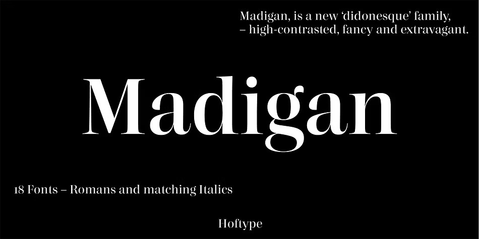
Madigan
Madigan is a high-contrast typeface that exudes crisp elegance and sophistication. While firmly rooted in modern typography, it has a lively, fancy quality that really comes alive in display sizes. With its OpenType format, Madigan supports up to 80 languages, making it an excellent choice for typographic applications of all kinds. Its range of 18 styles offers a fine graduation of weights, and each weight includes a comprehensive set of features, including small caps, ligatures, superior characters, proportional figures, and more. This attention to detail makes Madigan a versatile and reliable font for any project that requires a touch of sophistication.